
In color theory, color harmony refers to the property that certain aesthetically pleasing color combinations have. These combinations create pleasing contrasts and consonances that are said to be harmonious. These combinations can be complementary, split-complementary, color triads, or analogous colors. Color harmony has been a topic of extensive study throughout history, but only since the Renaissance and the Scientific Revolution has it seen extensive codification. Artists and designers use these harmonies to achieve certain moods or aesthetics.
Which combination of colors is pleasant, beautiful, is harmonious? Which combination is unpleasant, unattractive, is disharmonious?
Color theories should be able to give answers to these questions responses that can be justified and find common acceptance and that are universally valid, independent of cultural differences. Color theories cannot do this, however. The demands are too great. To treat the rich spectrum of colors, order must first be brought to their diversity. Some color theories, such as Chijiiwa's 1987 Color Harmony or Küppers 1989 Harmony Theory of Colors, are called harmony theories. But these are primarily systems for classifying colors, of which there are many. The first one, Aristotle's, has been mentioned. In one paperback alone (Silvestrini 1994), 70 others are briefly described, from Leonardo da Vinci in the 15th and 16th centuries to Goethe in the early 19th and Küppers in the 20th century. The many treatises and systems add something to the discussions but do not come to a standard, irrefutable conclusion. Goethe's Zur Farbenlehre (1810) is the best-known of all color theories. He argued vehemently against Isaac Newton's objectively demonstrable, physical statements about colors, guided by his conviction that color is primarily a phenomenon of human perception. At the end of his life, Goethe considered his color theory more critical than his literary works. Today, still, when one writes about or discusses colors, one cannot neglect Goethe's work. Starting with his aquarelle color wheel, Goethe answers the opening questions about color harmony. Admittedly, the available colors made things easier for him than for modern color theorists. There were no synthetic aniline dyes, not to mention the "neon" red and yellow colors that highway workers wore to protect themselves from speeding motorists.
Color Harmony and Disharmony in Goethe's Color Theory
In the following, the modern names for colors, e.g., magenta and cyan, will not be used, but rather those used in Goethe's time, which are still most common today. According to Goethe, a single color cannot fulfill our desire for color harmony; there must be more than one. Two can be enough, but not two that are adjacent on the color wheel, only ones that have a color between them on the wheel or are opposite one another.
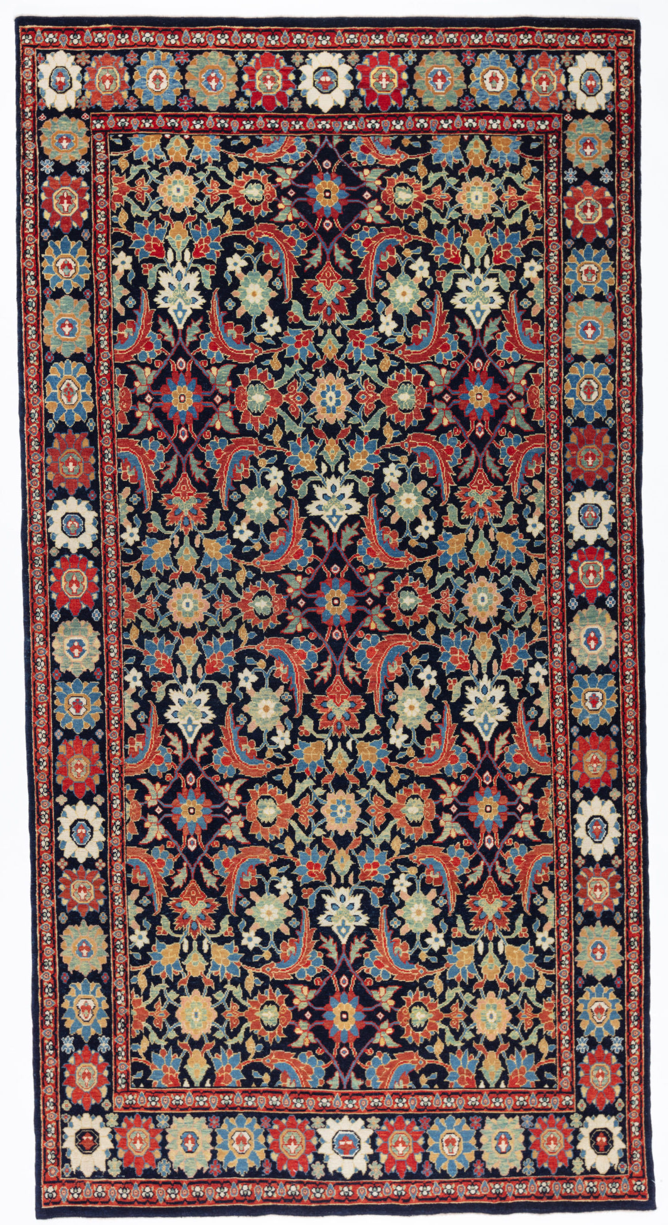 Model: ART00218
Fish Surrounding Lotuses Rug
The most appropriate colors to match the original is used for this rug.
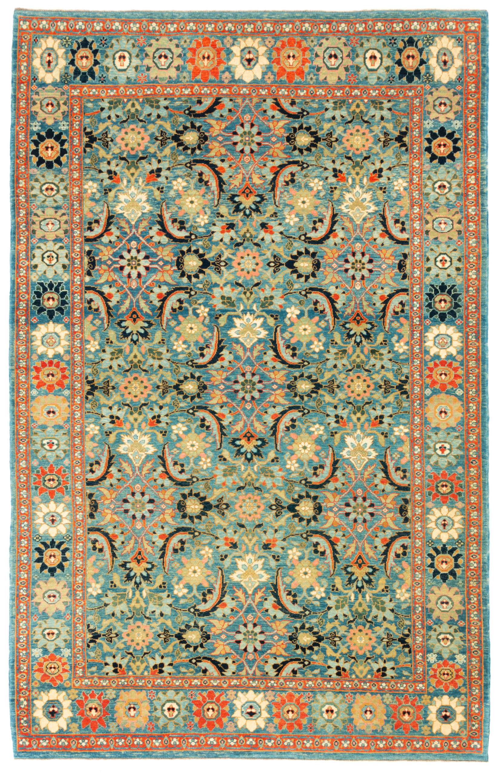 Model: ART00377
Fish Surrounding Lotuses Rug
Our designers interpret this rug's colors, considering the color mentioned above in harmony theories.
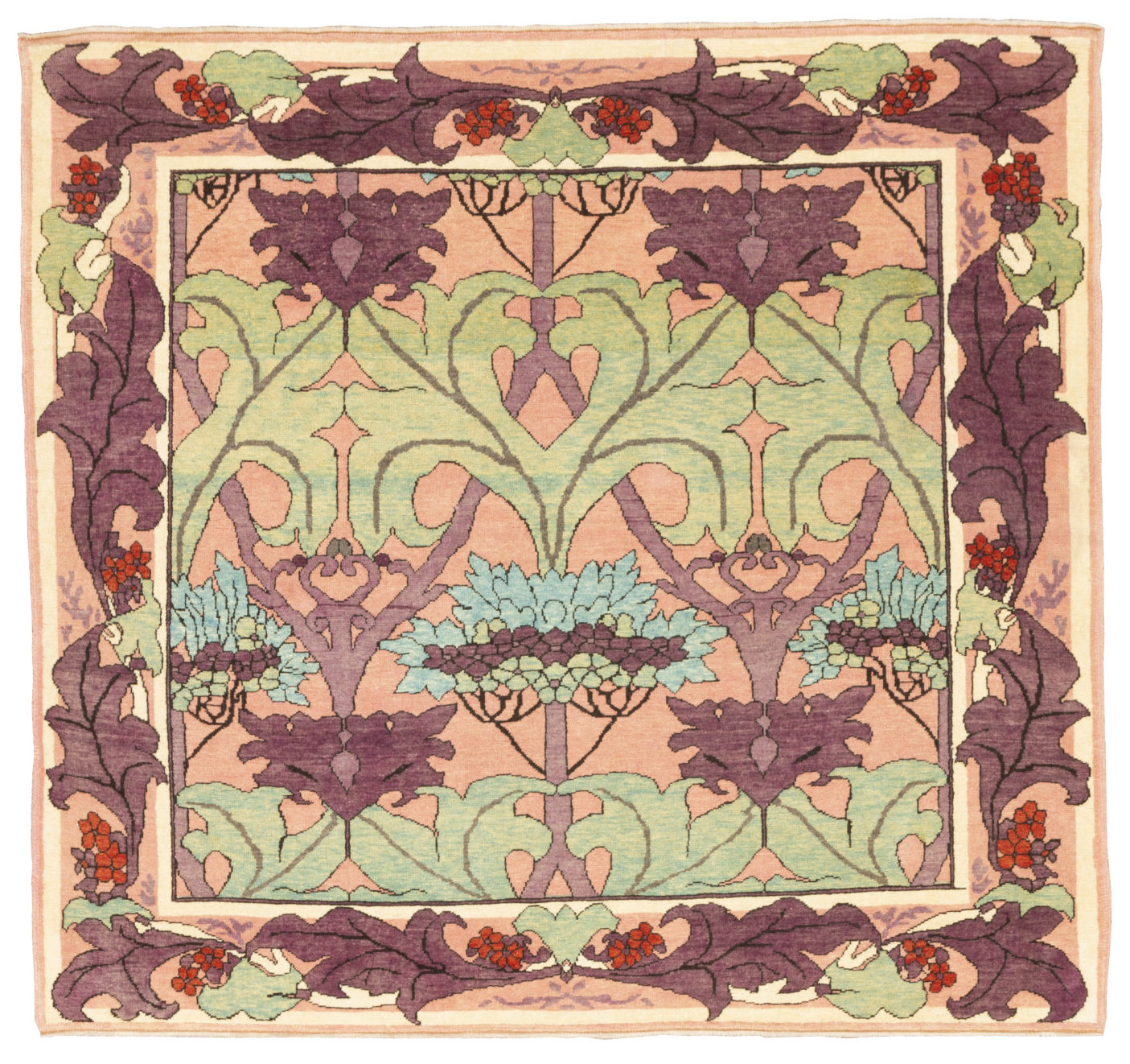 Model: ART00319
The Fintona William Morris Carpet
Our designers interpret this rug's colors, considering the color as mentioned earlier in harmony theories.
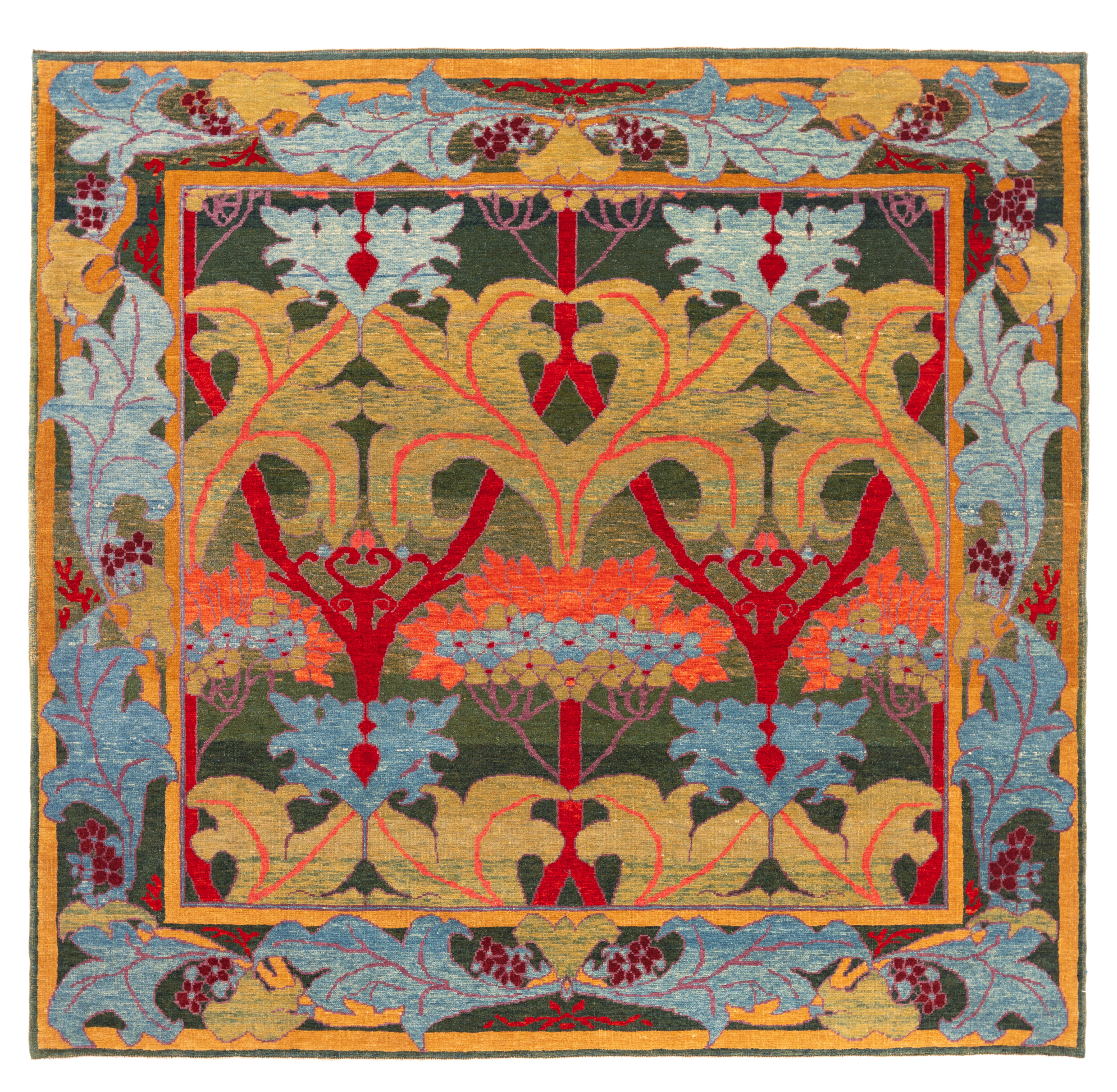 Model: ART00231
The Fintona William Morris Carpet
Our designers interpret this rug's colors, considering the color mentioned in harmony theories.